GDES-360 spring 2023 / David Ramos, American University Design
Encoding data
We’ll start by exploring ways of encoding data in visual form. For this first project, represent 24 hours of weather observations from Washington Reagan National Airport (KDCA), as a graphic.
Come up with two systems for picturing the data:
- A system that is as clear as possible.
- A system that is more expressive, but might not read as reliably.
This method of developing more than one approach—prompting you to make one version that works well and another that is more daring—will reappear over the semester.
There are conventions and widely recognized techniques for encoding data. We will look at them, in time. You can look at some of the systems for graphically representing weather, quite clever and fascinating ones, if you would like, but the main lessons for this project come from creating your own.
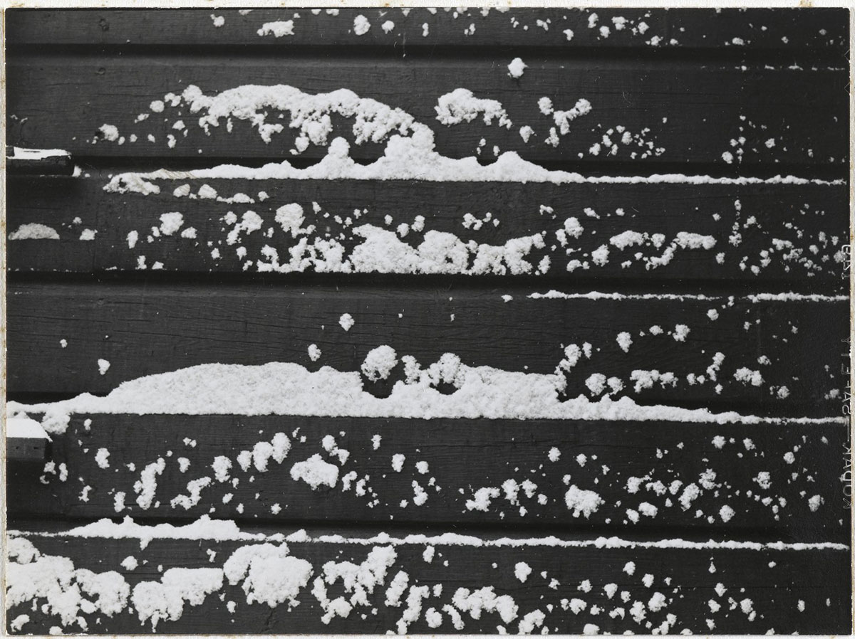
"[Untitled] (Snow on Clapboard)," by Consuelo Kanaga. Image: Brooklyn Museum, CC BY (original).
Specifications
Format: Present this on paper. For reading distance, assume that the graphic might be laid out on a table or posted on a wall.
Size: Each of your two versions can occupy up to 50 square inches. (A 1×50 in. sheet would work. So would a 5×10 in. sheet. Or a 3×3 in, though that would be a particular challenge.) Your two systems can be different sizes.
Color: Your choice. Personally, I’d find black and white easiest.
Production method: Create the visualization by hand. Be as precise as you can. Use tools: lay down a grid in pencil, trace over graph paper, measure with a ruler.
Text: You should almost certainly provide some text labels, and you can choose to include a key.
Readers: Design for an audience of high-school educated adults who do not work with weather data, but are curious.
Your data!
Washington/Reagan National Airport (KDCA) data are available through the National Oceanic and Atmospheric Administration/National Weather Service websites. You can work with the most recent 24 hours of data, if you like, but save the file because the data are continuously changing.
We might get a storm over the weekend, but if you’d prefer a little guaranteed drama, you can work with data that I saved, (ZIP archive w. PDF and HTML) that catches some snow.
Choices and explanations
One day’s data includes 24 hourly observations. You might present all 24, or you could look at every two, three, four, or six hours.
There are over a dozen variables. Choose three. At least one should be quantitative.
“Sky condition” is the cloud coverage, in METAR code. The entry BKN050 means broken clouds at 5,000 feet. For translating METAR, see an explanation archived from Weather Underground) or the Wikipedia article.
You’re working with a particular 24 hours, but ideally, the system could cope with a whole range of data. The data include entries for date and time. They don’t count toward your three variables.
Your largest choice, the central question in this assignment, is how to encode these data. It’ll be exciting to see what you come up with.