GDES-360 spring 2021 / David Ramos, American University Design
Change over time

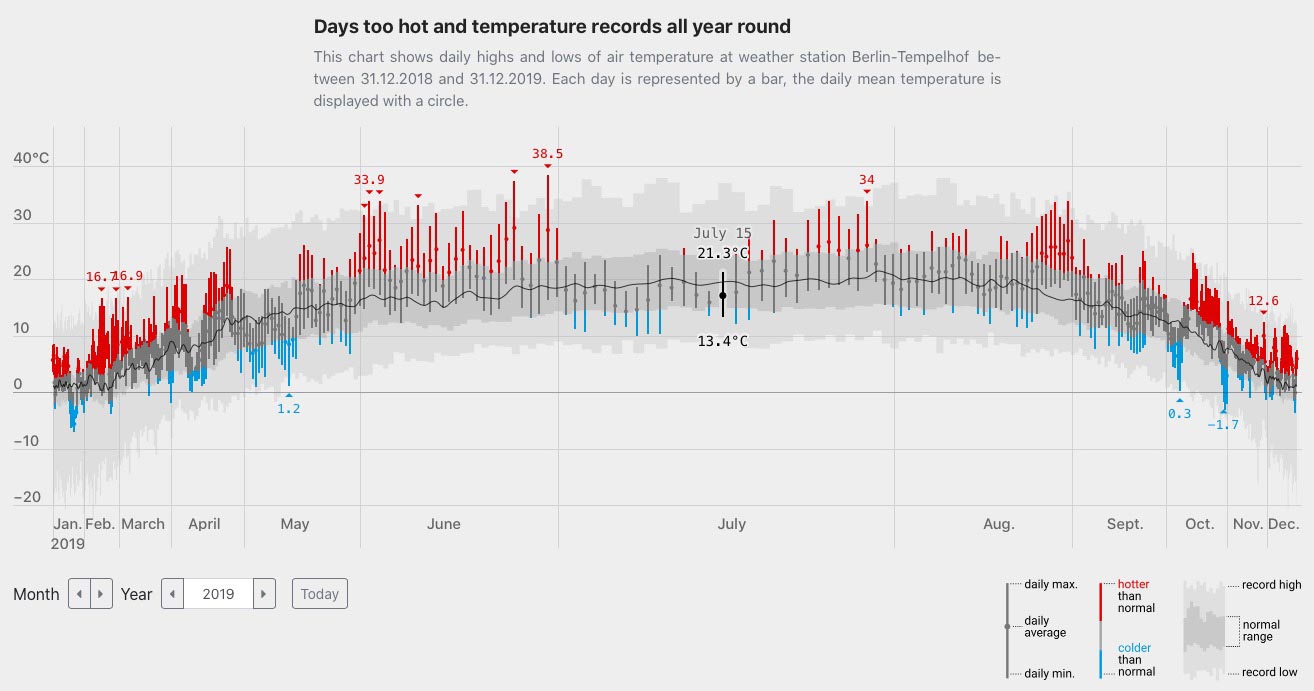
Plotting a time-based phenomenon. 2019 was hotter than normal — but what does this even mean?, by Gregor Aisch.
Take a look at tables of the largest cities in the US for 1790, 1890, and 1990, from a Census Bureau report on the 100 largest cities. There’s a story in these data.
The U.S. of 1790 is hard to recognize. At the time of the first Census, Salem, Mass. comes in 7th, with a population of 7,921. ¶ The 1890 Census shows booming industrial cities in the Northeast and the growing strength of the Midwest. Los Angeles is in 57th place, population 50,395, far behind boomtown Buffalo (11th place, population 255,664). Salem only just makes the list, in 100th place and 30,801 people. ¶ By 1990, Los Angeles has climbed to 2nd place, and four of the ten largest cities are in the Sunbelt.

Lower Manhattan seen from the S.S. Coamo leaving New York. Jack Delano, Farm Security Administration, December 1941. (Library of Congress.)
Questions
Your challenge, for this next exercise, is to explore the population data for American cities, past and present, to find insights within those data, and to communicate those insights in a visualization.
A few more seeds of ideas: The 1830 Census showed Baltimore as the second largest city in the country, but it is 30th today. Washington, D.C.’s population had been falling since just after WWII, but it recently rebounded and just hit 700,000. Detroit’s population plummeted in recent decades, forcing city leaders to make plans to help the city shrink.
You do not (necessarily) need to plot two centuries worth of Census data. It might be more illuminating to show us two or three years, especially if you are comparing several cities.
Start this project by exploring data
First, take a look at a CSV file that I compiled, with the 1990, 2000, and 2010 Census populations for selected cities (ZIP). Look at the data and plot them.
You have options if you want more depth
You don’t need more depth. If you’re curious, though, you can explore farther.
The Census Bureau report discussed in the introduction, Population of the 100 Largest Cities and Other Urban Places in the United States: 1790 to 1990, is an excellent source for historical populations. Data come in the form of text tables, which you’ll have to reformat.
Wikipedia often provides perfectly adequate background material and links to sources. See the List of United States cities by population article. Take care: if you must use Wikipedia data, make sure you know where the data are coming from and what they represent.
If you want to find recent data for any U.S. city, data.census.gov is probably the most robust way to find recent Census data about particular geographies, but the site is new and hard to use. I don’t recommend spending time on it, unless you’re intensely curious or already experienced.
On to design
As with the previous assignment, produce two versions. Make one version as legible and understandable as possible, and have the other express the meaning in the most compelling or intriguing way.
Your final project can be rough in the sense that type, color, and rendering need not be polished. (You can produce this by hand.) What’s important is that you think about techniques for visualizing change over time. Details still matter—they just don’t need to be finessed in software.
Each version might consist of a single visualization (that is, one figure), but you could also arrange several visualizations on the same page.
See the schedule for deadlines.
Specifications
- Trim size: up to 11×17 in., any orientation. It should probably be flat, but you’re welcome to surprise us.
- Color, grayscale, or black-and-white.
- The reader is generally curious person with at least a high school education, holding your piece at a normal reading distance for a book or a magazine.
- Provide labels and numerical values, but not necessarily for everything.
- A title is necessary, and an introduction will probably help. Please put your name on this.
- Provide notes about your sources, enough that we know where you got the data from. “Population data from decennial censuses, 1790–1990” would suffice.
- Print this for critique.
Tools and methods
Anything, really. Flourish or a spreadsheet will probably prove useful for exploring and for creating a rough visualization. You can make the final versions with Illustrator, by hand, or by another method.
For ideas about ways to approach this task, see chapters 5 and 8 from The Truthful Art. You might also look at the Showing Data Over Time selections at the Data Visualisation Catalogue, though not all of these choices are appropriate for the data or for your schedule.
If you’re working on paper, you can download graph paper from sites like print-graph-paper.
Issues to watch for
Read on, if you’re seeking detail.
The boundaries of cities change, sometimes dramatically. In 1890, Brooklyn and New York City still existed as separate municipalities. The present-day New York City, with its five boroughs, was consolidated in 1898. In general, cities grow to encompass ever-larger geographical areas. It is extremely rare for a city’s boundaries to contract, though that will soon happen in Georgia.
All of the sources linked on this sheet are comparing cities, but if you are thinking about a figure you read elsewhere, make sure that you are comparing apples to apples. The Census Bureau reports the populations of many different types of geographies. We are talking here about cities, defined by their corporate borders, not CSAs (Combined Statistical Areas or MSAs (Metropolitan Statistical Areas). The 2010 population of Washington, D.C., was just over 600,000, but the population of the Washington-Arlington-Alexandria, DC-VA-MD-WV MSA—a region that sweeps from Harpers Ferry to the shores of the Chesapeake Bay—was 5,582,170.