Color
Against my better judgement, I’m going to weigh in on that dress.
The lighting and image quality are terrible, which makes judging the dress’ color difficult. I have a guess about the color, but the image file doesn’t contain enough information to support a strong answer. The photo’s cropped to remove the context. The photo looks like what you get when a low-end camera’s struggling to cope with two different light sources, with the white balance cranked over to an extreme setting.
The image is difficult to read because most of the information we need in order to process it has been thrown out. The color of the dress is “Go reshoot that photo under decent, consistent light. Bring a better camera. And put a grey card in the scene.”
Crankiness aside, though, there’s something interesting going on.
Light has color
Color is a three part event that involves:
- The original material that’s reflecting light
- A light source
- The viewer
Look at the snow in the photo below. What color is it? White, yes? But if I were to sample the pixels in the image, I’d find that they’re a warm yellow-white, and a cool periwinkle blue.
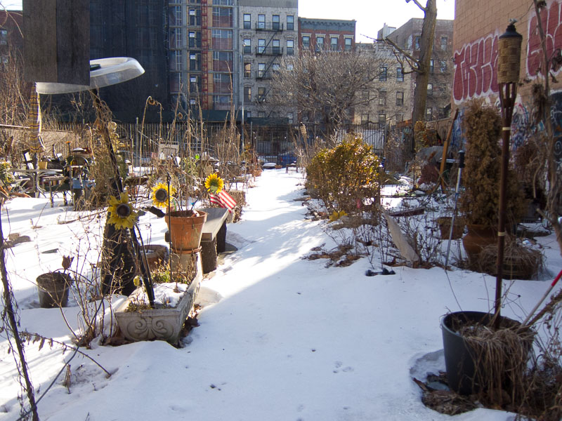
Snow on a sign in the East Village. It's convenient that we've been getting snow on the East Coast, because all that snow and variable lighting make for some good examples.
As you’re looking at this picture, several factors come into play:
- The way that your computer monitor’s displaying the image.
- How your eyes sense the color from the monitor, affected by variations in color vision.
- How you’re evaluating the scene.
- Your cultural framework for understanding color.
- The language you can use to express color.
I’ve seen snow before. I’m seeing a beam of warm, yellowish sunlight on the left side of the photo, with cool blue shadow on the right side.

This is a white sign. The pixels in the image are blue. If I messed about with the color balance, I could make the pixels all kinds of colors, but then the photo would look odd.
Light sources affect the color of reflective materials. We know this, and we use that knowledge to interpret the color of images. The dress’ color is controversial because it’s hard for us to understand the scene, and difficult to tell the color of the light.
Stop doing silly things
The Wired article just confuses matters. The core concept’s buried in there under a tangle of vague words, disorganized ideas, and unhelpful quotations from scientists. Neither the writer nor the color perception researchers are communicating well, not to each other, and certainly not to readers.
The Wired photo team shouldn’t have tried to pixel-sample images. It’s a silly move that can’t help recover the color of the original material. It also undermines the key lesson of the story, which is that the color of the material will change depending on lighting and the viewer.
Seriously: designers and photographers, stop trying to color-correct the original photo. There’s not enough information in the file.
Color’s wonderful!
Color’s wonderful and difficult precisely because it’s fleeting. It’s objectively measurable, with the right knowledge and equipment, and yet it’s subjective, dependent on culture and individual experience.
Shifts in color give us cultural monuments like Monet’s studies of Rouen Cathedral.
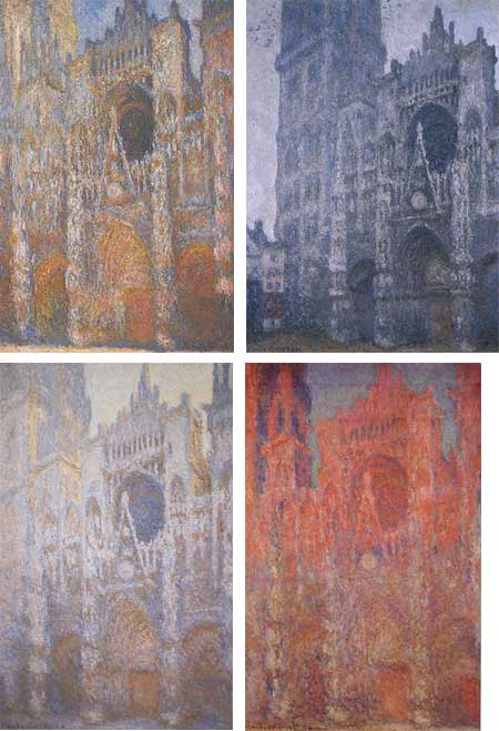
Rouen Cathedral series, Claude Monet, 1892–1893.
Color’s also hard to maintain consistently, even in materials. Dyes will vary from batch to batch. If you ordered that dress—please don’t—the fabric colors will probably be slightly different from the ones in the original.
Sources
Two good color references:
Bruce Fraser, Chris Murphy, and Fred Bunting. Real World Color Management. Berkeley, Calif.: Peachpit P., 2003.
Fil Hunter, Steven Biver, and Paul Fuqua. Light Science and Magic. Burlington, Mass.: Elsevier, 2007.