GDES-360 spring 2021 / David Ramos, American University Design
Dear data
We’ll start by looking at a compact dataset that you compile. Measure something that you encounter in your life, for four days. Anything interesting—perhaps the number of steps you take, hour by hour, or the people you communicate with, or what you cook and eat. Then present the data you’ve gathered in visual form.
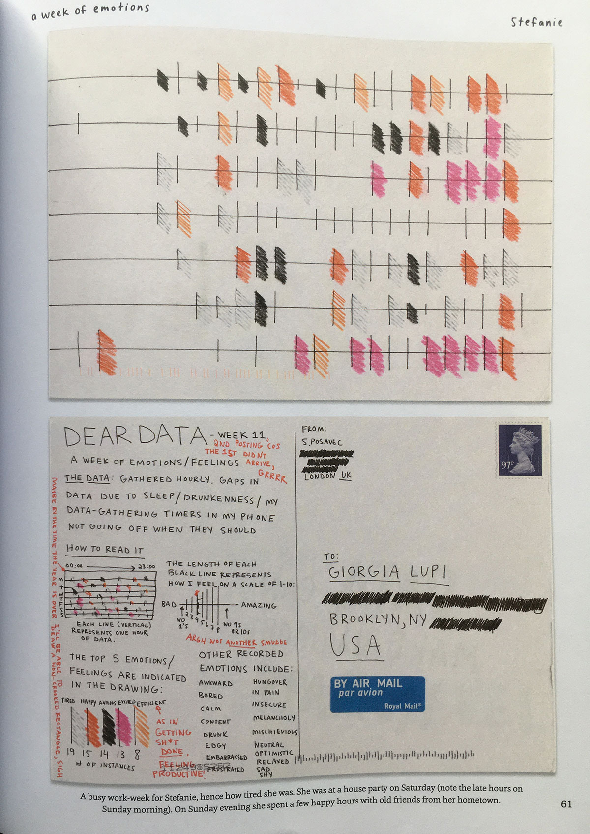
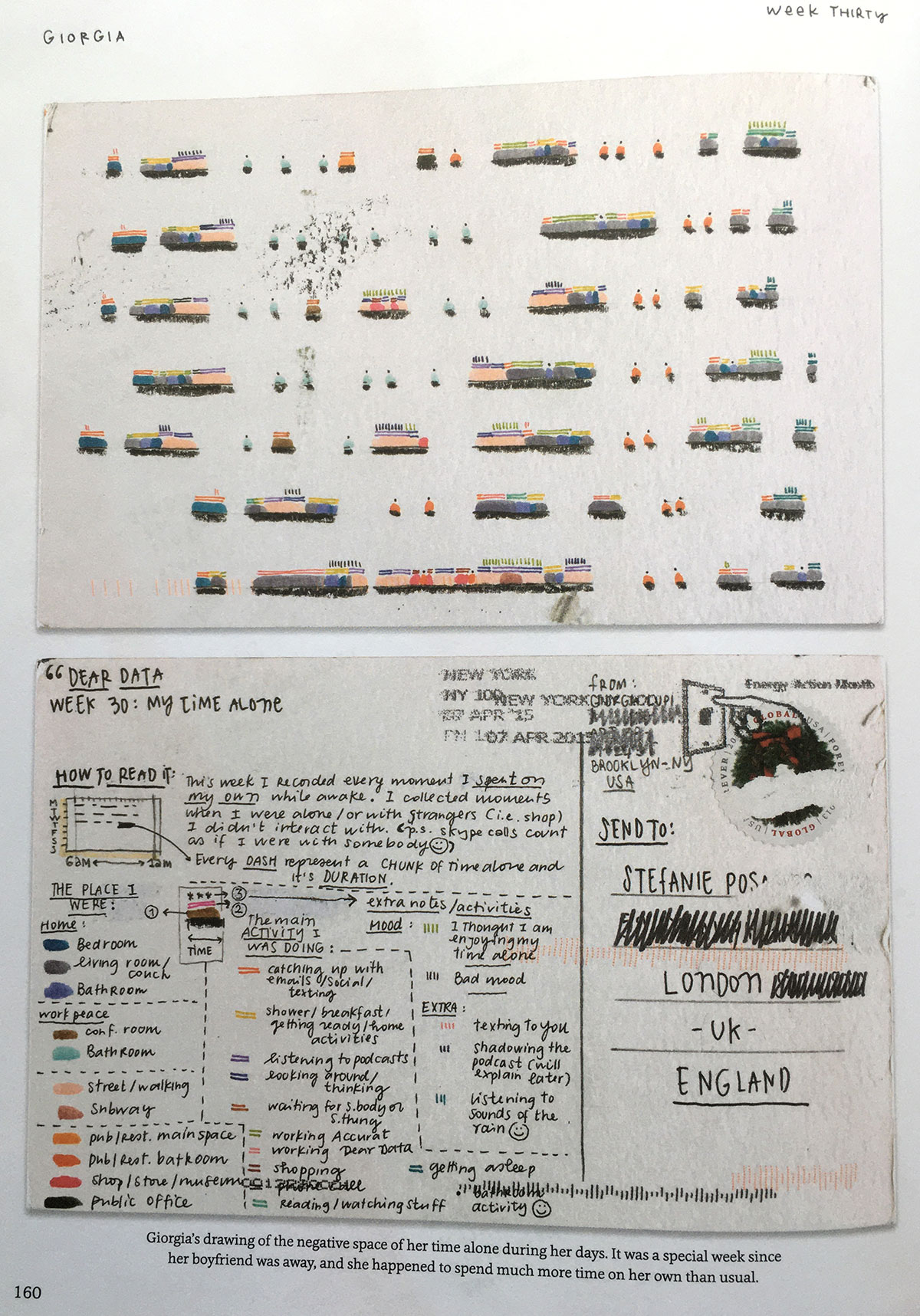
From Dear Data, by Giorgia Lupi and Stefanie Posavec.
This assignment builds on a series of postcards by Giorgia Lupi and Stefanie Posavec, in their Dear Data project. Take a look at those postcards by way of examples. You might also watch the designers’ video (3 min.).
Aim to produce a visualization that works forwards and backwards: the numbers create the forms on the page, and the forms on the page will let us discern the original values, at least approximately.
Also, type and language are still part of visualization. Give us labels that tell us at least some of those values. (Think about labeling the data points rather than tick marks on axes.) Add a headline or an intro. You can choose to include a legend.
Keep in mind that this is an intro project. There are many good answers. Surprise us!
From Dear Data, by Giorgia Lupi and Stefanie Posavec.
Specifications
Format: Do this by hand, and present it on paper. For reading distance, assume that the graphic might be laid out on a table or posted on a wall, with viewers at arms-length.
Size: Your visualization can occupy up to 50 square inches. (A 1×50 in. visualization would work. So would a 5×10 in. visualization. Or a 3×3 in, though that would be a particular challenge.)
Color: Your choice. Personally, I’d find black and white easiest.
Production method: Anything goes, just do it by hand. (Tip: you can draw this at a larger size, then scale down the visualization to final size by scanning or photocopying.)