Encoding data
GDES-396 spring 2020 (David Ramos, American University Design)
ramos@american.edu · office hours
We’ll move farther into this semester’s exploration through a systemic study of ways of encoding data in visual form. For this, second project, represent 72 hours of weather observations from Washington/Reagan National Airport (KDCA), as a graphic. Do this twice, using two different methods for encoding the data. Let the data determine your form; we should be able to see approximate values or observe patterns.
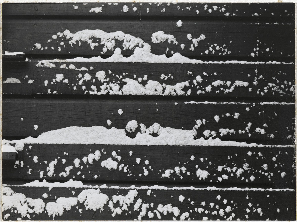
"[Untitled] (Snow on Clapboard)," by Consuelo Kanaga. Image: Brooklyn Museum, CC BY (original).
Some encoding methods you might choose
Alberto Cairo offers a good explanation of encodings on p. 124 of The truthful art.
- Quantity (e.g. pictograms, dot matrix)
- Position (line graph, scatterplot)
- Length (bar graph, stacked bar graph)
- Angle and slope (slope chart, radial line graph)
- Size (area) (proportional area chart)
- Color (hue/saturation/value, hue/chroma/lightness) and texture (heatmap)
- Symbol, conventional sign
When choosing your encoding methods, think about the elementary perceptual tasks that the reader performs in order to understand your visualization. (Again, look to The truthful art, p. 128.)
A few other considerations
You can look at some of the existing systems for graphically representing weather data, but the main lessons for this project come from creating your own.
We’re dealing with time-series data. Articulate the changes in weather over time.
It is perfectly reasonable to break your graphic into smaller visualizations, which might use different encoding methods.
Avoid pie charts for this assignment and, honestly, for the rest of your career.
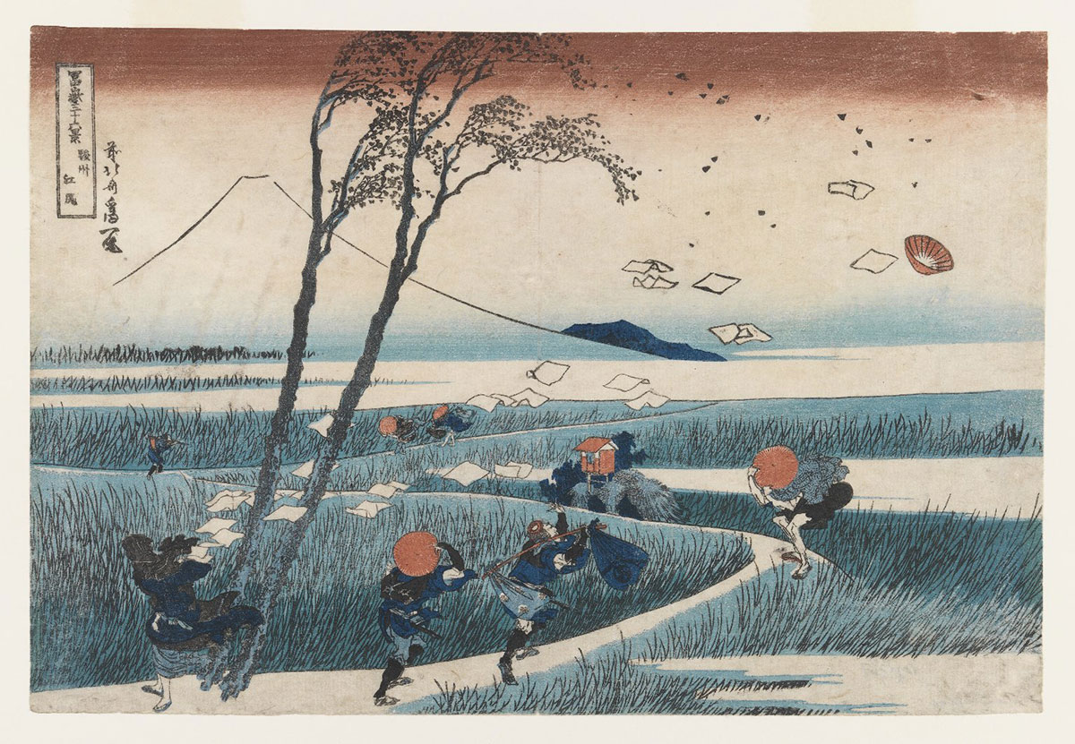
"Ejiri in Suruga Province, from the series Thirty-six Views of Mount Fuji," by Katsushika Hokusai, c. 1830–1831. Image: Brooklyn Museum, CC BY (original).
Specifications
You’re making two visualizations, each with its own approach.
Format: Present this on paper. For reading distance, assume that the graphic might be laid out on a table or posted on a wall.
Size: Each graphic can occupy up to 50 square inches. (A 1×50 in. graphic would work. So would a 5×10 in. graphic.) Your two systems can be different sizes.
Color: Your choice.
Production method: Your choice. Consider doing this by hand, at least for sketching out ideas and probably for the final piece. (Tip: you can draw this at a larger size, then scale down the visualization to final size by scanning or photocopying.)
You should almost certainly provide some labels, along with some key values, and you can include a legend.
Design for an audience of high-school educated adults who do not work with weather data, but are curious.
Your data!
Washington/Reagan National Airport (KDCA) data are available through the National Oceanic and Atmospheric Administration/National Weather Service websites. You can work with the most recent 72 hours of data, if you like, but save the file because the data are continuously changing.
You can also work with data from Thursday–Friday–Saturday, when the brief snowstorm arrived. You can download a ZIP file containing the saved data.
Choices and explanations
The three-day data include 72 hourly observations. You might present all 72, or you could look at every two, three, four, or six hours.
There are headings for over a dozen variables. Choose three. The “weather” and “sky conditions” columns contain non-numerical data, but you can absolutely choose to work with them. You can also choose to show trends in variables.
Sky condition is the cloud coverage, in METAR code (see an explanation at Weather Underground). The entry BKN050 means broken clouds at 5,000 feet.
The data include entries for date and time. They don’t count toward your three variables. You’re going to be presenting data at regular intervals. Try to find a solution that doesn’t require repeating the time across the entire visualization.
We’re working with a particular 72 hours, but ideally, the system could cope with a whole range of data.
Your big choice, of course, is how to encode these data. It’ll be exciting to see what you come up with.