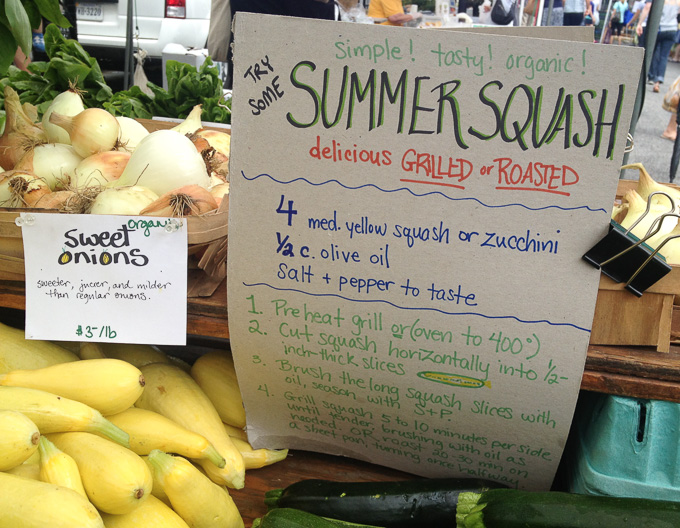
Recipe
GDES-220 fall 2019 (David Ramos, American University Design)
ramos@american.edu · office hours · interaction design resources
Websites are made up of many pieces that come together in the browser. This assignment takes a first look at web typography, using HTML to describe structure and shaping a page’s appearance with CSS. The tools we have on hand, at the moment, are simple, but they can speak loudly.
Part 1.1: Find a recipe
Find a recipe that includes a title, a paragraph or more of commentary, a list of ingredients, and a list of steps. Add any of these elements if they are missing.
Sources include:
- Vintage Cookbooks (Works published in the U.S. before 1923 are out of copyright.)
- Fannie Farmer, The Boston Cooking-school Cook Book (progenitor of the modern U.S. cookbook)
- A recipe you’ve written yourself. Even writing the text yourself, but borrowing someone else’s idea, would likely suffice. (Credit the original creator!)
- A recipe from someone else, who’s given you permission to republish.
For the first critique, bring in an original version or photocopy of your recipe.
Part 1.2: HTML
Think about the structure of this recipe. What are the different pieces, and how do they relate? Mark up this recipe as HTML, using semantic elements to describe the parts of the recipe. We will be styling the recipe later – for now, you only need to break the recipe up into its components.
You will need to use these tags:
- headings:
h1,h2, and possiblyh3–h6 - paragraphs:
p - lists:
ulorol;li - emphasis:
emandstrong - possibly, line breaks:
br
Start with the basic site files from GitHub. Do not create these files from zero. Use the starter and its folder structure.
Deliverables: one HTML file.
A note about HTML style
Best practice is to write tags as lowercase in actual HTML files, mainly as a matter of common coding style. When discussing tags, it usually helps to write the tags in uppercase for clarity.
Part 2: Type and CSS
Sketch out a design for the recipe, just with pen or pencil on paper. Design for readability and readability first – if you want to experiment with typographic fireworks, go ahead, but not at the expense of function. (You’ll have opportunities for more expressive typography later.)
You must choose fonts from the list of fonts for this class.
Make this a one-column design. Elements can have variable left and right margins, but don’t try to put blocks of text next to each other. We haven’t yet covered the techniques you’ll need to make multicolumn layouts. You may add images, if you wish, but they must be freely licensed, licensed to you, or of your own creation.
Lay out your design using CSS. Consider type (size, weight, typeface, letterspacing, case, and use of italics), paragraph width and margins, and text color. Rules, borders, backgrounds, and spacing can add drama and create visual hierarchy.
You will want to use some of these properties (not necessarily all):
- typography:
font-family,font-size,font-weight,font-size,line-height,letter-spacing - spacing:
margin,padding - color:
color,background-color - borders:
border
Remember that you can specify a particular margin, padding, and border for each side of an element.
Create a one-column design!
You might want a bigger vocabulary so that you can create, say, intro paragraphs or notes. You can add classes to elements to give yourself more formatting options.
Deliverables: One webpage, with HTML and CSS files. Please also show your sketches.
For due dates, look at the class schedule.
Let’s talk about design
We’ll continue to think about how complex websites need to be, but keep this project straightforward. You may remember, from a type class, Beatrice Ward’s 1955 classic essay, The Crystal Goblet. (John Naughton, in similar terms, argues that sites are more complicated than they need to be, in Graphic designers are ruining the web.)
Set your type big enough that people can read it: 16px is a good minimum size for body copy. In reality, that’s no bigger than print. If your type looks horsey, increase the line-height (leading), reduce your line widths (measure), or choose a font that’s better suited to the screen.
Scrolling is fine. If your content won’t fit on your screen, let the page scroll. You can’t design for one screen size. Someone, somewhere, will have to scroll, but the research shows that they will cope just fine.
You can always treat “big” type and scrolling as an opportunity to make beautiful things.
Some sites worth contemplating
- Yale e360 (by Upstatement)
Evaluation criteria
- HTML syntax is correct
- Use required HTML tags (see list in Part 1)
- HTML describes the structure of the content
- CSS syntax is correct
- Design: use of type, spacing, color, rules, and images to articulate hierarchy and structure, ensure readability, and create visual interest
- Is this a one-column design?
- Correct sourcing of recipe, code, and images