Type flyer
GDES-270 fall 2020 (David Ramos, American University Design)
ramos@american.edu · office hours
Create two different flyers, publicizing an (imagined) panel about the First Things First design manifestos. Explore type as a medium—aim to present information clearly, and also to create visual interest.

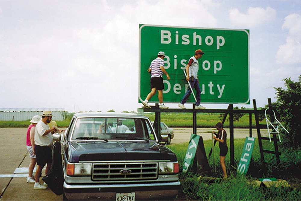
Field testing of Clearview, a typeface designed especially for use on highway signage. (Photo by Terminal Design.)
Stages of work
1. Background/research
Read the text, think about the flyer content, and read background material for the event.
2. Sketching for ideas
Start by working with pen or pencil, on paper. Draw thumbnails for flyers, no larger than 2 in. on their longest dimension. If you prefer, you can sketch on a thumbnail template (PDF). For advice on sketching text, see a Smashing Magazine article.
Think about:
- Type hierarchy
- Page composition
- Chunking and proximity
- Alignment and (intentional) misalignment
3. Detail design
Next, move to the computer. You’re welcome to work in Figma or in Illustrator.
Design your first flyer, using a single typeface. For this version, you should keep type size (point size) constant, but you may choose alignment, case, style (roman/italic) and weight (bold/normal/light).
Design a second flyer. This one may include two different typefaces (one serif, and one sans serif). You may vary type size, alignment, case, style, and weight.
4. Revisions
Create further iterations of the two flyers, based on feedback from critiques and your own reflections.
5. Export your work and turn it in
Export the two flyers as a PDF. Take photos of your thumbnail sketches. Upload these documents (to Blackboard §001/§003 ) to turn them in, and add your flyers to the shared Miro board for critique.
Requirements
Specifications
- Trim size: 8.5×11 in. (letter size), or 8.25×10.5 if using bleeds, vertically oriented
- Black and white, no color or gray
- Reading distance: flyers posted on walls or bulletin boards
Typefaces
For this project, choose from four font families. All are free/open source (so you can download and install them), and all are available within Figma. Do not use any other fonts.
- Alegreya and Aleygrea Sans, by Huerta Tipográfica
- Adobe Source Sans Pro (download), by Paul D. Hunt
- IBM Plex superfamily (serif, sans, and mono) (download), by Mike Abbink and Bold Monday
- EB Garamond, by Georg Mayr-Duffner
Text
Use all of this text in your flyer. You may rephrase or resequence the text.
We, the Undersigned
Reconsidering First Things First for 2021
A panel with Rick Poynor and Paola Antonelli
Moderated by Ellen LuptonAmerican University
Abramson Family Recital Hall Katzen Arts Center
4400 Massachusetts Ave. NW, Washington, D.C.November 5, 2021 at 6:30 p.m.
Rick Poynor, author and design critic, founded Eye magazine and co-founded Design Observer. He helped coordinate the First Things First 2000 manifesto.
Paola Antonelli serves as Senior Curator of the Department of Architecture & Design at the Museum of Modern Art.
Ellen Lupton directs the MFA in Graphic Design Program at the Maryland Institute College of Art, and is Senior Curator of Contemporary Design at the Cooper Hewitt, Smithsonian Design Museum.
Background
The First Things First manifestos:
- “First Things First 1964.” Image of original spread; live text.
- Poynor, Rick. “First Things First Revisited”. Emigre Magazine article, 1999.
- “First Things First 2000: a design manifesto.” As published in Emigre #51; live text.
- First Things First, 2014
- First Things First, 2020 Edition