Conference
GDES-220 fall 2020 (David Ramos, American University Design)
ramos@american.edu · office hours
Build a website for a hypothetical conference about technology, design, and society. Aim to create a site that would convince a potential audience member to attend. Consider navigation, user experience, typography, image choice, and the value of templates and shared stylesheets in web development. Think of this website as a single system, built from many smaller and reusable parts.

The conference
Date, location, and audience
The conference should take place in about one year—your choice of dates—and should last for 1–1.5 days. Events take place in Washington, D.C. or elsewhere, at your choice of venue or venues. (Assume in-person; consider an educational institution or a major hotel.) You may choose audience and other details as you wish.
Possible topics
“Right now, my field must tackle describing a world where falling in love, going to war and filling out tax forms looks the same; it looks like typing.” (Quinn Norton)
Choose one of these topics, or propose a variation on one of these topics.
- Technology and physical-world communities
- Usable design
- Privacy and surveillance
- The future of journalism
- Technology and democracy
- Community and online harassment
- Accessibility
- Narrative and emotion in interaction design
- Regulation and the sharing economy
- Internet infrastructure
Speakers
Your conference must include at least seven speakers from this list. You may also include speakers who are not listed, but the conference topic must follow logically from speakers on this list.
- Jason Santa Maria
- James Mickens
- Mike Montiero and Erika Hall
- Ingrid Burrington
- Susan Kare
- Ethan Marcotte
- Ezra Klein
- Bruce Schneier
- Laura Poitras
- Zoë Quinn
- Masamichi Udagawa and Sigi Moeslinger
- Andrew Blum
- Rebecca Solnit
- Tim Brown (IDEO)
- Janette Sadik-Khan
- Edward Snowden
- Brian Chesky and Joe Gebbia
- Cindy Cohn
- Ethan Zuckerman
- Richard Saul Wurman
- Dan Tangherlini
- Jeffrey Goldberg
- Massimo Banzi
- Dana Chisnell and Whitney Quesenbery
- Tyler Radford
- Nadine Chahine
- Val Head
- Jeffrey Zeldman
- Trevor Paglen
- Alberto Cairo
- John Maeda
- Jen Simmons
- Chappell Ellison
- Kristy Tillman
- Tim Berners-Lee
- Sharon Mattern
- Maciej Cegłowski
- Manoush Zomorodi
- Roman Mars
- Zeynep Tufekci
- William McDonough
- Kate Orff
- Billy Fleming (McHarg Center)
Phases of work
See the class schedule for due dates.
Phase 0: Getting to know topics
Look through the example websites and conferences on this assignment sheet. Observe how they use images, how many types of pages there are, how design elements carry over from page to page, and how many different types of type are present.

Phase 1: Research and conference idea
Look at who the speakers are—think about their careers, but also about the sorts of things they’ve written. Explore ideas for conference topics, and do background research about the issues.

Phase 2: Visual systems and components
Start by gathering the visual elements that go into your design. Show us two (2) different concepts. Explain these concepts using a combination of:
- Type sample sheets. Show us choices for typefaces and type styles. (Choose web fonts!)
- Image samples–sheets with images that look and feel like the ones you might use.
- Color swatches–sheets showing the colors that you might use, larger swatches for colors that would cover large areas, and smaller swatches for colors that would appear more sparingly. Alternatively, you could make element collages, in color–sheets showing the pieces that might go on a page. Think about buttons, links, previews for articles, author bios, stacked headlines, and photos with captions. You want to establish the look of the design, without yet worrying about layout. See Dan Mall’s article for more.
- Moodboards
Documentation packet template in InDesign (ZIP), if you would like to use it.
You’ll also need a list of pages or a site map.

Phase 3: Pages and layout
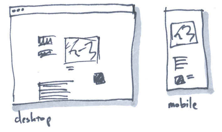
Refine your design direction, then prepare layouts for pages. Pursue two concepts. (We’ll settle on one during critique.) Sketch out your layouts, keeping both mobile and desktop browsers in mind.
You probably need three or four types of pages. Create page templates, then reuse the layouts and code across the site.
- Home page
- Inside page for most of the site
- Schedule page
- Speaker bio page?

Phase 4/5: HTML/CSS and content
Produce a live site in HTML/CSS. Start by completing one page, perhaps the front page or a page type you’ll reuse. Then make templates for the other pages.
Write the text for your site, gather images, and insert copy and images into the HTML.
Turning work in: bundle your code, PDFs of your sketches, and a readme.md file into a folder and ZIP compress.
Website specifications
Content
- Provide information that potential and registered participants would need, including material about the conference’s concept, each speaker, and the venue. Write your own text, which can be a paraphrase of someone else’s words.
- Publish a bio for each of your speakers, in your own words, of at least one paragraph.
- Create a schedule of events and talks, with at least a one-paragraph description for each event. Think about what your speakers might plausibily talk about.
- The site does not need to provide a live registration system. Text noting when registration opens will suffice.
- Where possible, use images that you create yourself, or that are freely licensed. If necessary, you may use small images of speakers, speakers’ work, and venues to which you do not have rights.
- Cite sources for all images in a readme file.
- Build a site of 5–8 pages.
Technical
- The website must work well in desktop browsers, and must be usable in small-screen mobile browsers. (This means media queries, most likely.)
- Write semantically meaningful, correct HTML.
- Start your site using the basic site template (ZIP).
- Do not use a CSS framework for layout. No parallax sites.
- Provide a readme file noting the source of all images, text, code, and other materials used in the site (text/Markdown).
- Choose your fonts from the list of fonts for this class.
Examples
Conference sites
- Open Book Workshop (this is close to the size of your site)
- AIGA Converge
- An Event Apart (multiple events)
- XOXO
- TypeCon
- Van Alen (multiple events)
- Open House New York
- DC Design Week
- Creative Mornings (multiple events)
- Doors Open Baltimore
Notable for design
Consider typography, layout, image use, structure, and pacing.
- Quarterly.co
- A List Apart
- Extra Virgin Suicide
- Liverpool Biennial
- Eephus League Magazine
- Edits Quarterly
- Jason Santa Maria candygram articles
- Lost Worlds Fairs
- The Pantry at Delancey
- Marie Lorenz (seeing places by artist-built boat)
- Los Angeles Urban Rangers (a kind of guerrilla interpretation project)
- Triple Canopy on the Meadowlands
- Jazz Age Lawn Party
- New York Times, “Snow Fall”
- InfoAmazonia
- Paperholm
- Losing Ground by ProPublica
- The End of Brooklyn
- Edible Geography
- Fallen Fruit
- The New English Landscape
Systems
Learning outcomes
- Explain essential ideas in contemporary design and technology criticism, and arrive at positions of your own
- Apply an iterative design process to the web
- Create a design for a website that reflects the tone, message, and content of that site
- Organize a complex body of information
- Design navigation systems and layouts for a multi-page site
- Evaluate websites for usability and accessibility
- Build a site that works on mobile devices and small screens