Farecard
GDES-315 spring 2017 · American University Design
Instructor: David Ramos ( ramos@american.edu · office hours )
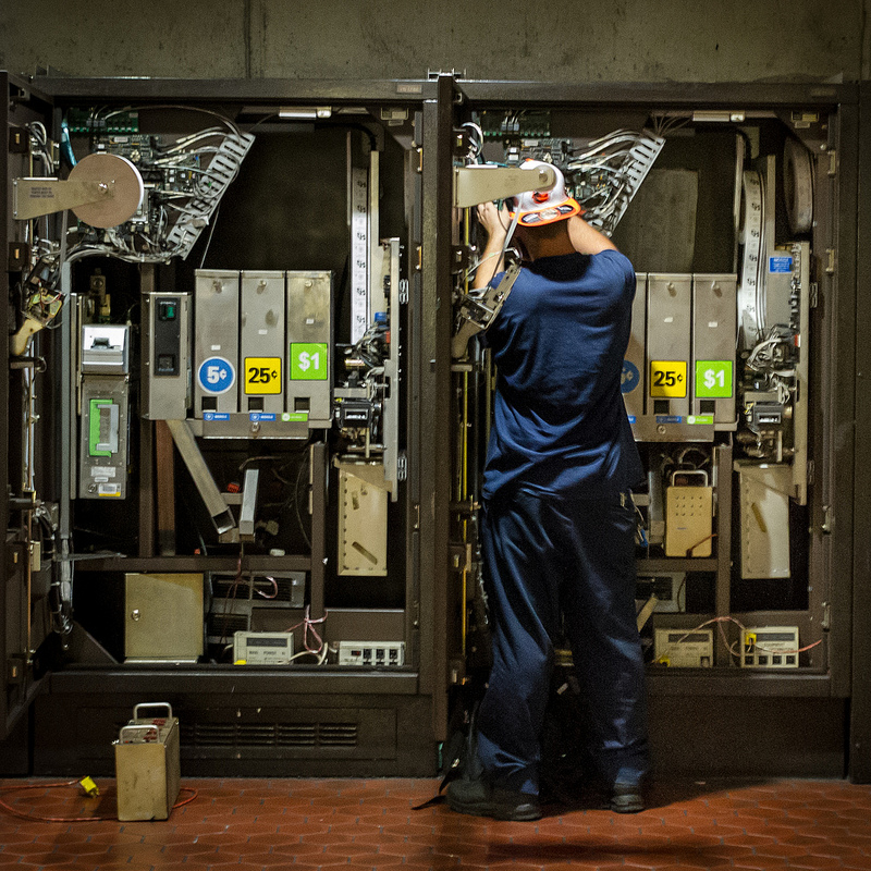
We interact with a variety of machines in the course of a day. Some of them are simple, like drinking fountains with one button to active water flow. Some, like Metro’s farecard vending machines, are far more complex, with designs shaped by historical engineering requirements and layers of unplanned growth.

Farecard machine under maintenance, by ep_jhu.
Imagine that we now have the chance to create new farecard vending machines. Study the way that people use the existing machines and report on their strengths, their failings, and any unmet needs or ideas you have for improvement. Plan a flow for the user, then create three paper prototype interfaces, each examining a different approach, and test these prototypes with people from outside of the class. On the basis of your findings and in-class critiques, create a final paper prototype and repeat the user testing.
Design for today’s world, with today’s mix of users and requirements. Machines should occupy the same footprint as the current machines, and should work with existing SmartTrip cards, credit cards, and currency. Use real-world technology.
Users should be able to:
- Add fare for trips and buy passes using both credit cards and cash (although you may add separate machines that are credit-card only)
- Check balances
Note: the “farecard” machines now no longer dispense farecards, only SmartTrip cards. Suggestions are open for what else to call the machines, and this project.
Objectives
- Create interactive pieces that work as part of a system.
- Experiment with ways of navigating complex information.
- Improve designs through iteration and through usability testing.
- Explain interactive projects using design documentation.
Phases of Work
1. Observation/research/reflection
In this phase, try to answer four questions: who uses these machines? how do people use the machines? what do different people need and expect? and how well do the machines serve those needs and expectations?
Research part 1: Start by using one of these machines yourself. Then observe people at the machines, watching for any differences between different users. Write a paragraph or two that summarizes your observations.
Research part 2: Interview friends and colleagues, asking not only what they think about the current machines, but what they expect from a machine. Prepare a one-page document that answers all four questions—the document can include text, diagrams, and images. Based on your findings, suggests areas for improvement.
2. Conceptual design
Think about how you would redesign the machines. Explore three or four approaches. For each idea, create a flowchart that maps out a user’s experience with the system; a drawing of the front of the machine; a sketch of a few major screens; and any other details or screens that you need to explain your draft idea. Your drawings do not need to be well resolved – they just need to explain how the machine should work.
3. Design development
Create one final proposed redesign, drawing on what you have learned from user testing and critiques. Fill out the remaining screens and interactions.
Test your design with users. Find friends, relatives, or colleagues – two to four people will do fine. Test the paper prototypes against these people, and observe the results.
4. Documentation
Produce a documentation booklet with screen mockups, diagrams, and notes.
Deliverables
Present your work as a 17×11 in. (landscape) booklet, printed and as a PDF, and an interactive prototype (which need not be digital). For the booklet, an informal binding like binder clips or wire-O would suffice.
Include in the booklet:
- A 400–600 word report on your observations about how people use the current machines
- A 50–200 word description of your intentions for your redesign
- High-fidelity wireframes of key screens and off-screen elements
- A flowchart that describes the entire system
- Anything else you need to explain your idea
- Captions that provide background or context for your images
- Sketches and process
Provide in the booklet, packaged separately, electronically, or some combination of these formats:
- A low-fidelity prototype that lets a user follow several paths through the system
Resources
- Richard Grefé and Jessica Friedman Hewitt in the New York Times: How Design Can Save Democracy (see also the interactive feature)
- AIGA Design for Democracy project: Ballot and polling place design guidelines (look at Ch. 5, “5–Rolling DRE Ballots”)
- NYC MTA wayfinding kiosks article and portfolio entry
- IDEO ATM redesign and video
From Metro
On reserve in library
- Lausen, Marcia. Design for Democracy: Ballot + Election Design. Chicago: The University of Chicago Press, 2007.
- Brown, Daniel M. Communicating Design: Developing Web Site Documentation for Design and Planning. 2nd ed. Voices That Matter. Berkeley, CA: New Riders, 2011.